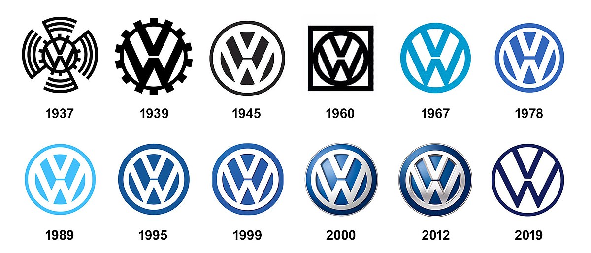
Volkswagen is a car manufacturing company. The company was established by the German Labour Front. It is one of the most successful car manufacturing companies in the world. The German name Volkswagen translates to car for the people. Adolf Hitler had the idea of creating the car Volkswagen when he visited an auto show in Berlin. The company has changed its logo several times since 1937. From the first design, the logo had the letters V and W incorporated into it one above the other. In this article, we will look at the history of Volkswagen logo.
Volkswagen Logo & Symbol
1937-1939
The first logo of Volkswagen had two letters V and W. The letter W was placed below V. The letters were inside a frame of cogwheel in a frame. A Rounded Swastika symbol was also incorporated into the logo of Volkswagen.
1939 -1945
The logo was redesigned and the swastika symbol was removed from the logo. The letters V and the cogwheel remained in the logo after the redesign. The new logo was more balanced and proportional, unlike the first logo.
1945-1948
The logo created in 1945 remains the foundation of today’s logo. The design was a simple circle with the letters V and W in it.
Also read: Top 10 Celebrity Scandals That Shook Hollywood in 2024
1948-1960
The logo was redesigned in 1948. The new logo was proportionate and clear. The simple design showcased the simplicity and accessibility. The logo aligned with the mission of the company to produce cars for all people. This version of the logo was used for a decade. The color of the logo was redesigned to black and white.
1960-1967
A square logo was designed for Volkswagen in 1960. The idea behind the design of this logo was to maintain the brand image of the car company. The company started manufacturing cars for the global market during this period. The square frame of the new logo of Volkswagen in black and white showcased the stability of the brand Volkswagen.
1967-1978
The logo was redesigned and the square was removed from the logo. The circular design was brought back during this time period. The new design of the logo was similar to the design in 1945. The color of the logo was changed to blue. The logo of the Volkswagen became more elegant in this design.
1978-1989
During this time the logo was designed in such a way that the white V and W symbols were on a blue background. The size of the letter V was also reduced when the logo was redesigned. The design also had two circular frames, unlike the previous design.
1989-1995
The logo was redesigned and the blue color was changed to a lighter blue. The blue color in the design was also brighter than the previous design. The proportions of the design were also changed a bit. But the design looked similar to the previous logo
1995-1999
The color of the logo was again changed to another shade of blue during this time. The color was a darker blue shade than the previous logo design. The new logo seemed more professional and elegant. The Volkswagen company used this logo for almost five years.
1999-2000
The redesign of the logo has indeed increased the volume of the logo. Gradient shades were added to the blue background of the logo. A lighter shadow was also included in the white bold lines of the letters. This was a transitional logo from the car manufacturing company Volkswagen as the three-dimensional logo was introduced after a year.
2000-2012
In the year 2000, a new three-dimensional logo was created by the Volkswagen. The white color of the letters V and W was changed to a silver tone. The blue background was redesigned with a more intense and calm shade of blue. The new balanced logo looked more powerful and elegant.
2012-2019
The three-dimensional logo was redesigned with more three-dimensional effects. The logo size was also reduced a bit in this version of the logo. The lines of the letters V and W got more sharper in this design. A strong and elegant look was incorporated into the logo by maximizing the three-dimensional effect of the logo.
2019-Present
The Two-dimensional logo came back in the year 2019. The brand has launched new electric cars and the new logo was designed to celebrate the new milestone of the company. The new logo has a white background with black letters v and W inscribed in a black circle. The flat design aligns with the new trend. The new design shows the eco-friendly and sustainable approach of the company.
Conclusion
The logo of Volkswagen has gone through a lot of redesigns. The logo of Volkswagen has always tried to align with the new trends in design. The redesigning of the logo also shows the progressive approach and innovation of the Volkswagen car manufacturing company. The latest design, launched in 2019 represents the unique identity of the brand. In this article, we have detailed about the Volkswagen logo history.


